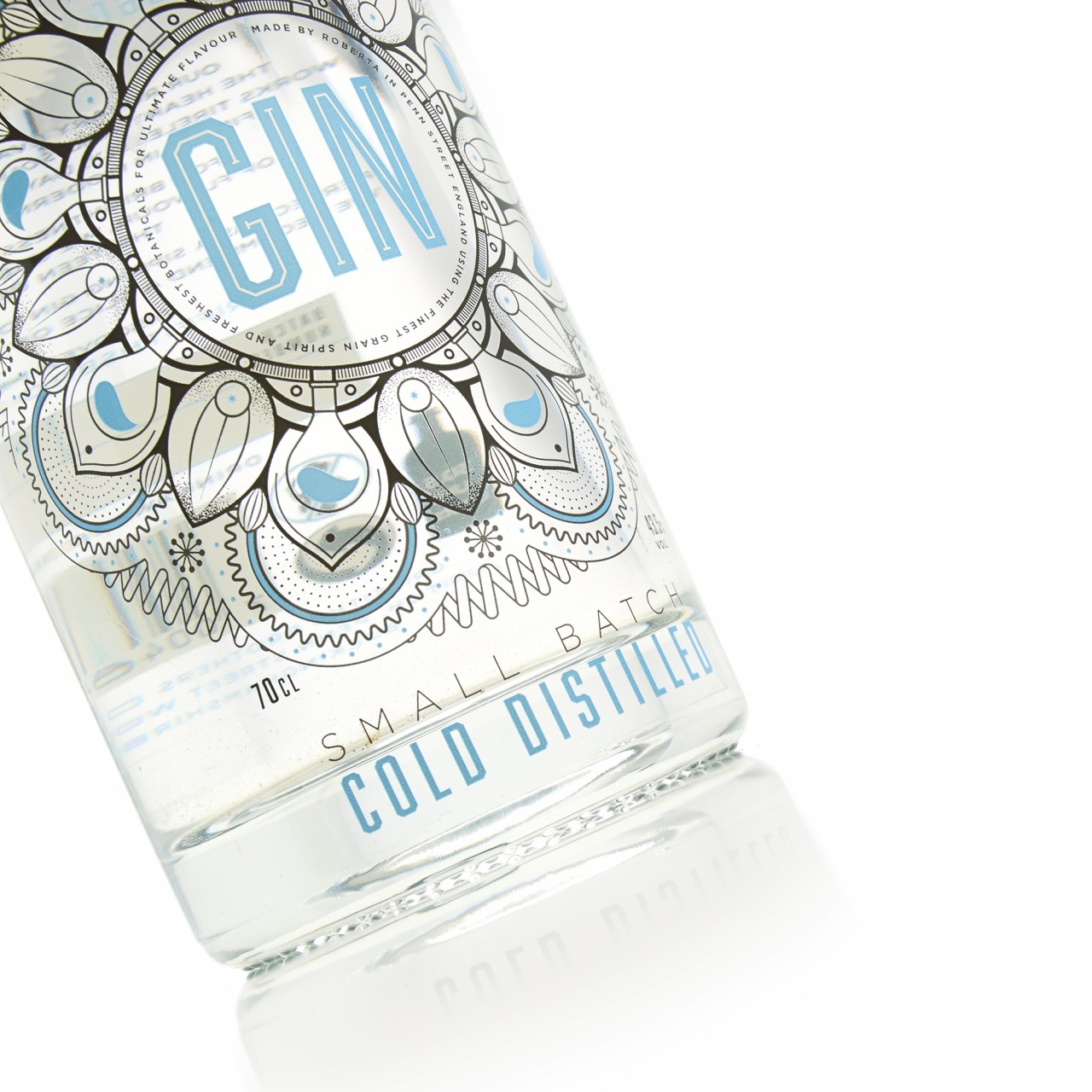
Royston Labels has created label packaging for Griffiths Brothers' Cold Distilled Gin, combining simple black line work with evocative detailing and flashes of blue. This may sound fairly simple, but using thermochromic ink, the blue portion of the label will only appear when the Gin is considered cold enough to be enjoyed at its best. How cool!
The Griffiths Brothers name is associated with premium gin that has been created using cold distillation to better capture the flavours of the botanicals, so in manufacturing the label for this special drink, the Royston team used a series of specialised techniques to ensure the highest quality finish.
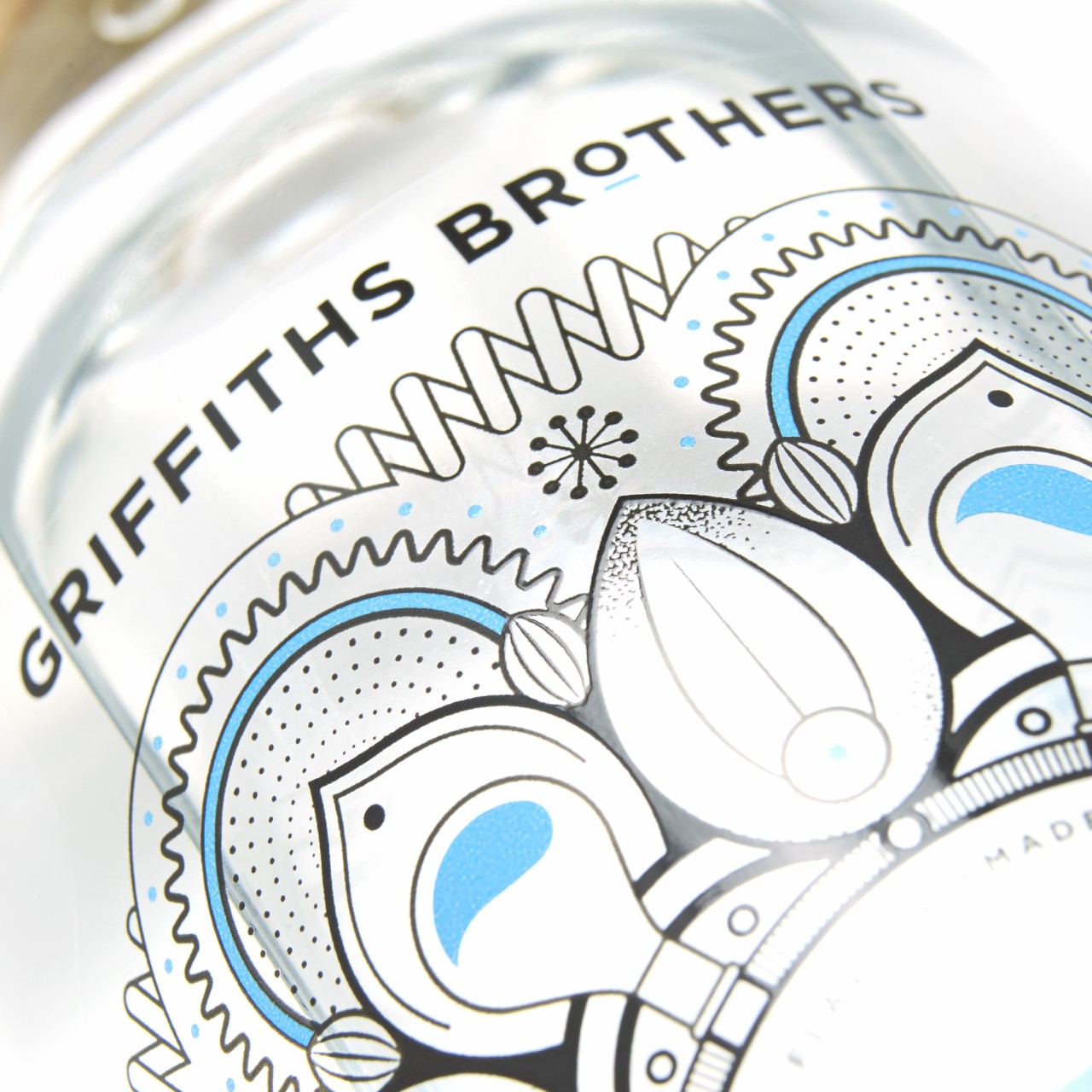
The label was printed on a clear material to ensure that it was sufficiently and that the large, bold design was clearly delineated. High definition raised print was applied to give a smooth textural quality to the text, and vibrant blue detailing was achieved with premium inks.
For an innovative finishing touch, a heat-responsive section was added to the back. They manufactured this portion of the label using thermochromic ink, which turns blue when the gin is cold enough to drink. At warmer temperatures, the blue fades – indicating that it’s time for a trip back to the refrigerator.
Though impressive, this gin label’s colour-changing capabilities might be dismissed by some as the printing equivalent of a parlour trick, if not for the fact that it serves to reinforce the key selling point of this premium gin. Unlike traditional distillers, Griffiths Brothers created this gin using cold distillation, the better to capture the flavours of the botanicals used in its making, and ultimately making for a cleaner, brighter taste.
Designed by Milestone and printed by Royston Labels, the Griffiths Brothers Gin label is also an excellent example of digital inkjet printing. CMYK + White were printed on 50 micron Fasson Clear polypropylene (PP) film, with the white going down first to provide a neutral background for the vibrant blue and some of the leaf details. The vibrant Blue ink was then applied via flexo to the name of the gin and as an accent colour.